
Little Einstein
E-commerce toy store UX Design - 2018.1
Little Einstein is a new online retailer of curated and innovative learning kits for kids. It was formerly a beloved shop in Park Slope Brooklyn that sold all types of DIY kits (both analog and digital), but the storefront was too expensive and the shop closed in 2012. The owner wants to convert the store to online only and the owner (Alberta) now wants to focus her inventory on technology and electronics products geared towards kids ages 4 - 15.
Overview
This is a team project aiming at designing an online toy store experience. The object of this project is to practice our user researching skills and build comprehensive information architecture based on our customer needs. I was solely responsible for the user research(interviews), interaction design, wireframing and prototyping.
Design Process
During this project, we went through the whole design process from research, ideation, test, prototype and assessment.
Research
CLIENT NEEDS
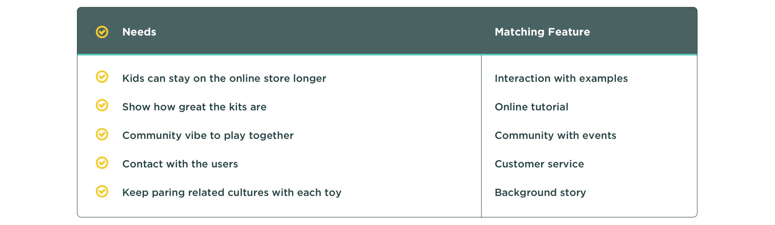
The primary goal for Little Einstein is to become the #1 resource for parents that want to incorporate hands on STEAM (Science, Technology, Engineering, Math, Art + Design) education into their child’s everyday learning experience. The brand of Little Einstein celebrates learning while allowing kids to experiment and play with technology. The new online store will reflect the STEAM focused Philosophy of Littler Einstein by featuring new, innovative products, while at the same time maintaining a playful and creative vibe that was found in the store. The new website should inspire parents to spend money and feel like they made a good investment on a toy that will give the gift of learning.
MARKETING POSITION ANALYSIS
According to our client’s requirement, we reviewed three existing online stores to get inspiration and did a simple marketing position analysis to figure out what should our position be.
In the three of the online stores, MoMA Design focuses more on commerce and less on education; Makershed focuses more on interaction and education; Raspberry focuses on education and less commerce. None of them has features related to cultural differences. Based on the first research, we decided to firstly balance commerce and education, then pay attention on interaction and add cultural part.
CONTEXTUAL INQUIRY
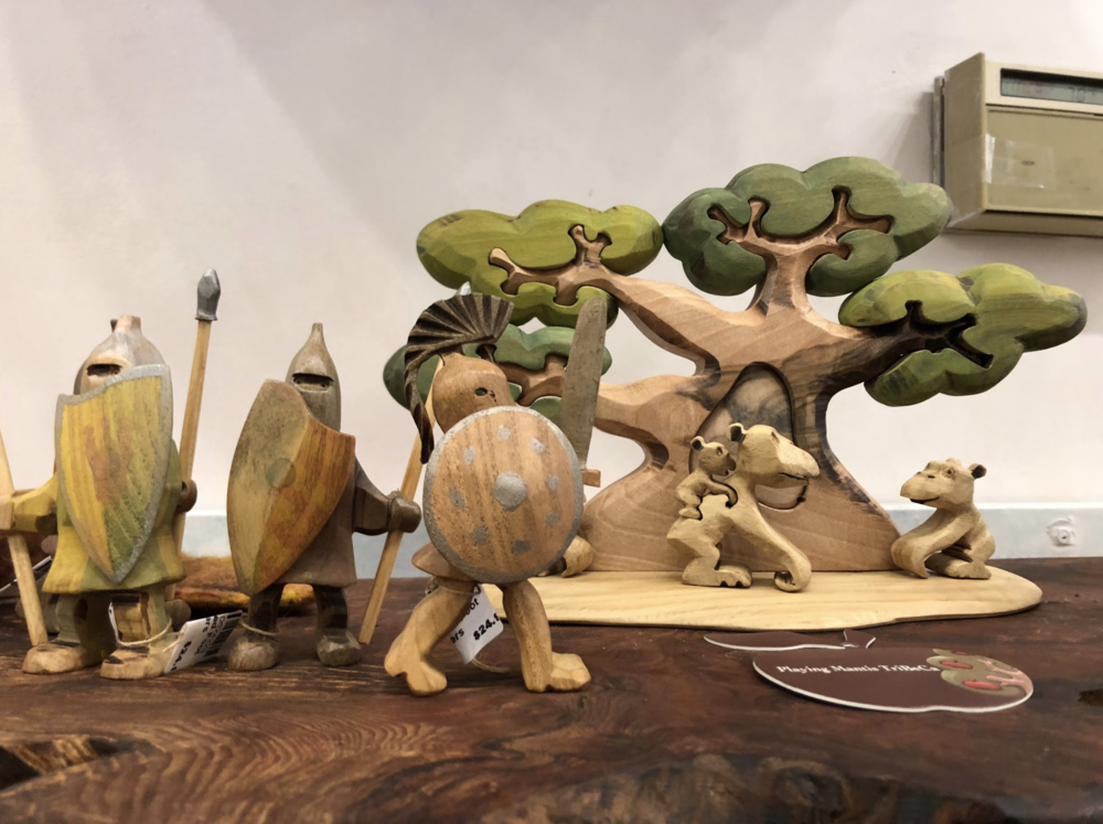
Lovely wooden toys from the store.
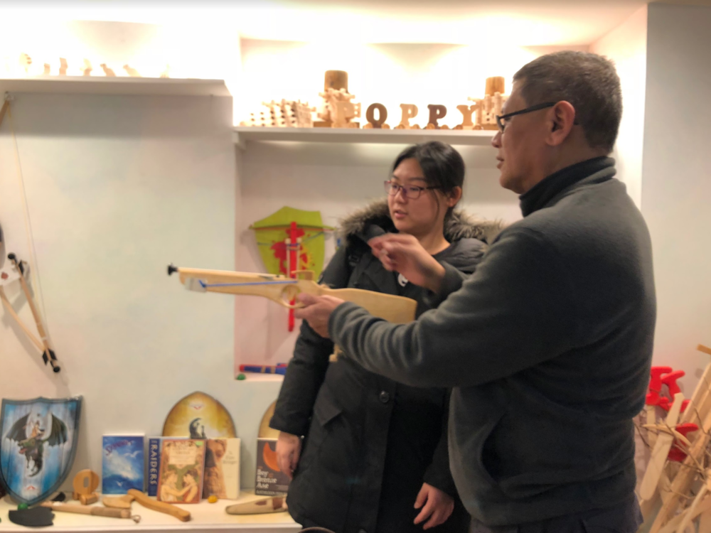
Store owner, Mr. Chat, showing us the wooden gun.
After we had a basic understanding of online toy store, we went to a local toy store to take contextual inquiry. We did a questionnaire at first and prepared to interview the employees, the customers and the kids (if it is possible). Lucky thing is we met the co-owner, Mr. Chat. He shared lots of precious information with us. And we interviewed two customers in total about their shopping needs. According to our contextual research, we collected the information from our interview and divided it into two parts as follows.
PERSONAS
Based on our research, we created four personas as our target user group.
Ideation
CARD SORTING

At first we sorted the products by STEAM, but it seems not as useful as ability radar.
1st User Test
We did the first user test about which category is better. After tested with 5 people, we found 4 people chose the ability radar, so finally we used ability radar as the main category method.
SITEMAP & USER FLOW
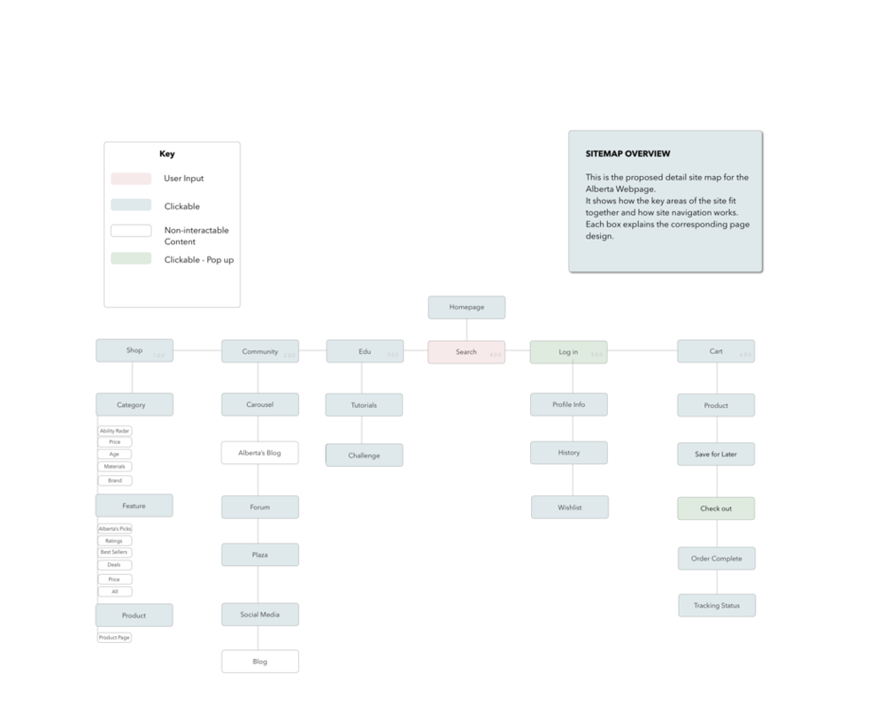

Our first sitemap includes Four Main Pages: Shop, Community, Education, Profile, as well as two global functions: Cart and Log in.
2nd User Test
We invited our roommates to take a test and noticed that profile and log in is repeated and the relationship between homepage and main pages are wrong.
Iterated Site Map
For the second version, we merged profile and log in into a global function, and add the homepage as a new page.
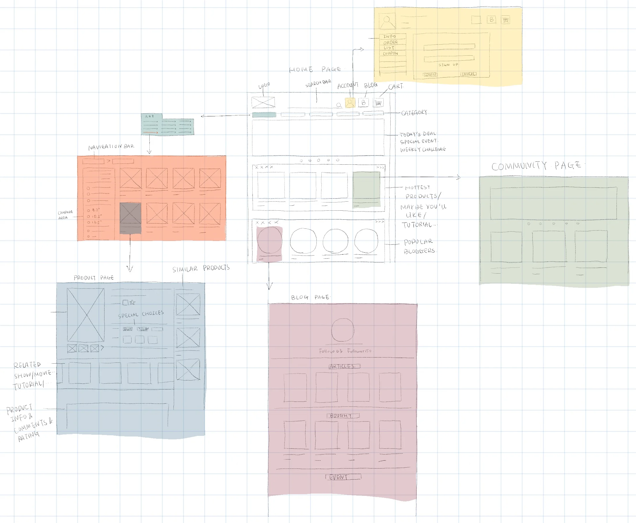
PAPER PROTOTYPE & USER TASKS

Shopping Task (Easy)
Your 12-year-old daughter really likes robots. You want to buy the best rocket for him.
Shopping Task (Medium)
You need to buy a gift for your 10-year-old nephew but you don’t know what does he like.
Discovering Task (Difficult)
You want to know something about the rocket toys.
USER TESTING: PAPER PROTOTYPE


Shop without signing in
Our first user Kevin said sometimes he just wants to buy something directly without log in, so we need to add a quick checkout
Sign In / Sign Up
Added different sign in/sign up pages depend on different user tasks. (By click profile and by checking out from the cart)
Image Direction
Image of the product on product page too close to related products area, sometimes misunderstanding
INTERACTIVE PROTOTYPE
Try our interactive prototype: https://u2u5jc.axshare.com/#g=1&p=home
USER TESTING: INTERACTIVE PROTOTYPE

Category Reminder
Category icons should have recognizable reminder
Back Links
Place order page should have button to go back to cart and the other back links
Message Page
Quick link to track package
Recommend Links
Added functions on the confirmation page to community and education part
Assessment
Based on our initial research on client needs and user test feedback, we evaluated our design.